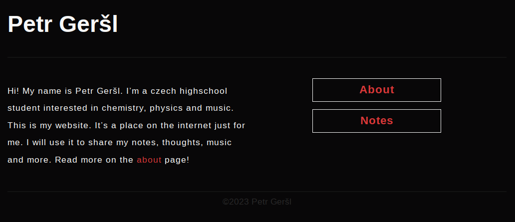
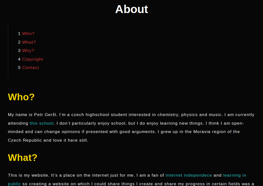
Do you even recognize this site?
My website, pgersl.xyz, is going through a massive change, not only in terms of design. New features are here and more are soon to come. There is also more content coming, let’s go through all of this.
New design
When I first designed this site more than a year ago, I wanted it to be primarily functional, without many features and useless design elements. Over the past year, I slowly found the design offputting and rather than rewriting the CSS, I decided to just redo the site from scratch. It proved to be easier afterward.
The site now has a clear and responsive structure that works on computers, tablets and phones of all kinds. The structure on smaller devices is handled mainly by some light JavaScript via different menus.
The navigation bar at the top now stays sticky so that it’s accessible from anywhere when you scroll down. The section of the site you’re currently visiting stays highlighted for even easier navigation. In these articles, the table of contents is now also sticking to the top for easy navigation in the article. Wanna see it? Just scroll down and it will appear as soon as the header disappears from your view! You can check out the table of contents by pressing the list icon on the left. If you just want to go to the top, press the up arrow button on the right.
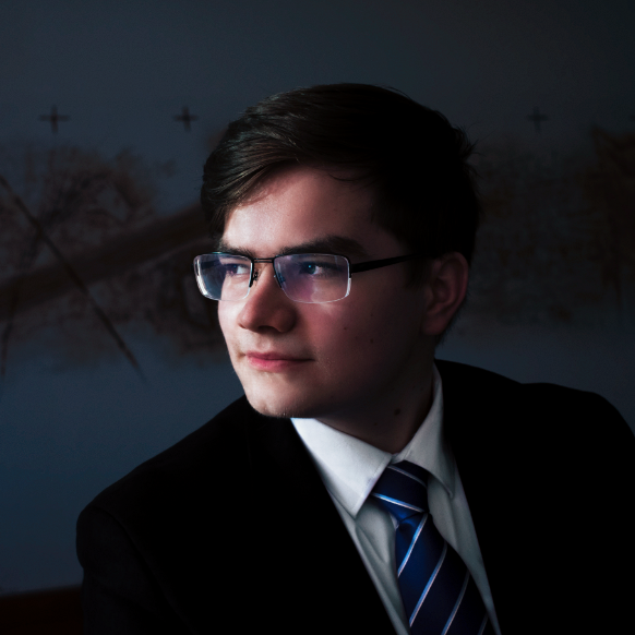
The newly added sidebar is a place for all the most important features on the site. You can see me up there, hello, along with some important links and new features. It also always sticks with you while you’re on the site and is always accessible from the navigation bar on smaller devices.
The content of the footer didn’t change a whole lot, only one new feature was added.
Colors
A new monochromatic color palette was devised carefully so that all colors work together and complement each other well. Check out all the colors that are being used below:
Fonts
The site currently uses three fonts, serif, sans serif and monospace. The serif font is used for the main bodies of text, paragraphs, blockquotes and so on. Headings and other parts of the site use the sans serif font. Monospace font will be used very rarely when code is presented or mentioned somehow. Check out these fonts below:
New logo
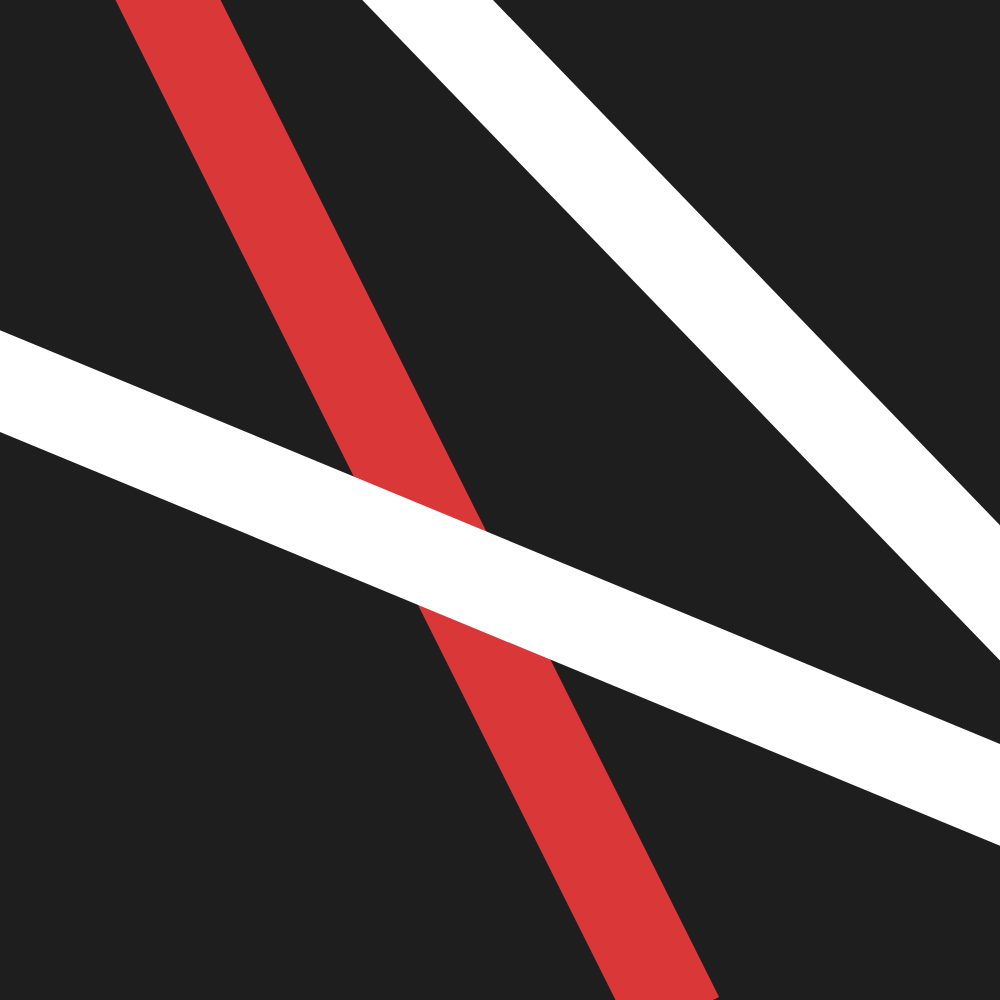
With a new design and philosophy behind the site, a new logo was also needed. I abandoned the old abstract design of a few lines on a gray background and went for something that contains me, my initials to be precise. Compare the two:
New features
New icons
I started using Font Awesome for almost every icon on the site. Their design is simple and pretty straightforward. The font is easy to implement and their looks speak for themselves. Consider adding them to your site!
Some other icons come from Flaticon. Their implementation is quite easy. They are used only where Font Awesome can’t provide. It’s not a font like Font Awesome, you can just download PNGs and add them as you wish.
Tags
The articles will now be further organized by tags. The tags page will be accessible on the Articles page.
Copy link button
The one new feature which was added to the footer is the copy link button. By clicking it, the link to the page you are currently visiting will get copied to the clipboard for easier sharing.
Dark and light theme
One big new feature added along with this new look of my website is the option to change the theme. The default theme is light, but it can be very easily changed to dark using the theme toggle button in the sidebar. Your theme preference is stored in local storage so that you wouldn’t have to change it on every page you visit.
Site search
My site now finally has a site-wide search. When you don’t want to browse through the whole site to find an article or a galley post, you can just search it using the search button in the sidebar.
The search is written using a combination of some rather new HTML elements, like <template> or <dialog>, clever CSS, effective JavasSript and JSON for better performance.
Multilingual support
Probably the biggest new feature of the new site is multilingual support. The site will be available in three languages: English, Czech and French. All content will be available in English and most content in Czech. I will attempt to translate the content from English to Czech as soon after the English content is released as possible, a day at most between is the hope. Only some content will be available in French since that is the language I’m just learning right now.
I translate the site on my own with minor help from dictionaries and translators, which is why not all content is accessible in all languages.
You can switch between languages using the flag icons in the sidebar. They only appear once a translation is accessible. They should all be visible on the homepage right now.
New content
As some of you might have noticed, no notes are available on my site right now. Not a single file and they won’t be. Because I am going to create a whole new site for them, and not just that!
New websites
As of right now, no work has been done on the three new websites I am going to be launching soon, hopefully by the end of August or September. These are going to be subdomains of my main site (this site) dedicated to notes, music and services.
The reason for creating separate sites for different types of content is simple:
- Simpler content management.
I believe that by separating the stuff I create into different sites, the navigation through it will be easier.
- Simpler design management.
The design I have devised for this site is ideal for the things that will be here, articles and photos. I want to handle my notes in a very different way to what the articles here could provide, their layout is going to be different and a whole lot more. I want to handle my music differently and creating a site for it might motivate me to do more of it. The website for services is still being thought through, but it is meant to be a place dedicated only to the services I offer or plan to offer in the future along with a showcase of what I have already done.
More articles
With the exception of this article, there are no articles on the site. That, I want to change. Writing articles about things I do or learn about is a great practice. It teaches me not only how to write in English (which is not my native language) but also, primarily, how to think. I consider writing to be one of the most important skills a person has, and thus, I want to promise something, so that the whole internet can see. I will write more of them. This one is just a start, more is coming, hopefully soon.
Gallery
I am not a photographer, but I would like to learn how to take good photos and edit them so that they look even better. The first collection, which will get published along with this article (in English) is not mine, but my friend’s. I am posting them just to show and test how the gallery is going to work. Having it there will hopefully motivate me to take more photos and create a place somewhere else than soystagram or cringebook for me to post them.
That’s all the site has to offer right now. But remember, more is still coming!
